Daniela
Thursday, December 5, 2013
Monday, November 25, 2013
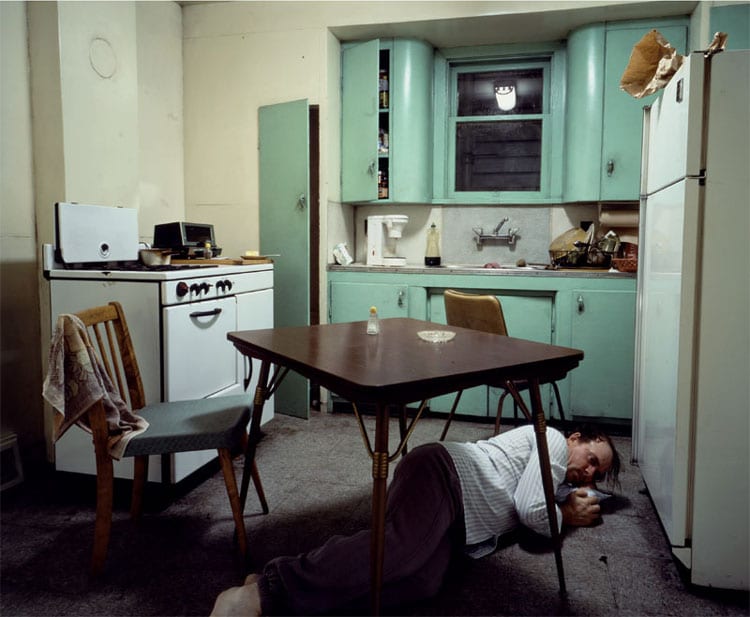
Insomnia, Jeff Wall
Jeff Wall’s photograph, Insomnia, stood out to me because of the natural unease created by the scene. The half opened cupboards, the disorderly chairs, the figure laying on the floor; this list just goes on. Jeff Wall's use of backlit transparencies brings this otherwise dull and muted kitchen to an eerie life. The vertical lines created by the furniture in the room bring the viewers attention down to the sleepless man laying on the floor. The man in the photograph gives off a sense of depression, restlessness, and even hopelessness. Jeff Wall illustrates a real and common sensation. His portrayal of insomnia is a very relatable state of being. Wall has captured a moment of pure desperation. The scene is very confined. It looks as though the walls are closing in and are just about ready to engulf this helpless man on the ground. The kitchen's claustrophobic and trapping nature almost echo the emotions of the man in the photo. My reaction to the piece was understanding and empathy. I could relate to the man in the photo who appears to have tried everything, yet nothing appears to be working.
Thursday, October 17, 2013
Assignment 3: Humans of UTSA
If you had one wish, what would it be?
I wish that I would get the scholarship I applied for. It's for a pre-med study abroad program in Spain!
What is the happiest moment of your life?
I would have to say this past weekend. I went to ACL. The last day was cancelled due to the rain, but I still got to see my favorite band perform a free show in the parking lot of a homeless shelter. It was awesome.
What has been your greatest achievement?
Getting my degree in architecture. It was such a great experience working on all sorts of projects, especially when working with a team.
What would your super power of choice be?
My super power would be osmosis. I'd love to be able to touch a book and learn everything in it.
What is an accomplishment your most proud of?
I helped start a quidditch team here at school. I love that it gives me a way to express my nerdy geeky side in an athletic way.
Tuesday, October 8, 2013
Color Critique
Overall Adria's photos show a strong awareness of compositional strategies. Each photo exhibits a strong sense of color recognition. The color pop in each is very unique. The first photo is flooded with color. The vivid gummy letters create a multitude of color changes because of their transparency. Your eye travels fluidly throughout the photo. Adria's fourth photo shows a great interaction of converging lines. The longer you look at the photo, the more apparent all the varying shades of orange come into view. The lightbulb adds yet another pop of color to the composition. Both the orange background and the illuminating lightbulb balance each other out quite nicely.
Thursday, October 3, 2013
Wednesday, September 25, 2013
Assignment 1: Composition
Aperture: 5.6
Open Frame
Shutter: 1/200
Aperture: 5.6
Asymmetrical
Shutter: 1/100
Aperture: 5.6
Alternate Point of View
Shutter: 1/10
Aperture: 5.6
Converging Lines
Shutter: 1/20
Aperture: 5.6
Curvilinear Lines
Shutter: 1/20
Aperture: 5.6
Diagonal Lines
Shutter: 1/30
Aperture: 5.0
Shape
Shutter: 1/1600
Aperture: 5.6
Movement
Shutter: 1/125
Aperture: 5.0
Frame within a Frame
Shutter: 1/320
Aperture: 5.6
Subscribe to:
Comments (Atom)


